Create a Stunning Gallery Wall: A Practical Guide to Styling Your Space
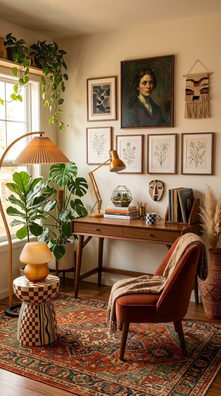
Transforming a blank wall into a focal point can dramatically elevate your home's aesthetic, and a gallery wall is a versatile and personal way to achieve this. The image showcases a beautifully styled wall above a mid-century modern desk, featuring a mix of artwork, a portrait, and a woven tapestry. This arrangement demonstrates how varied pieces can come together harmoniously, creating visual interest without feeling cluttered.
Achieving a balanced and aesthetically pleasing gallery wall involves more than just randomly hanging pictures. It requires a deliberate approach to selecting frames, art styles, and the overall composition. The arrangement in the image offers valuable lessons: the use of similar frame colors (wood tones) provides a unifying element, while the varying sizes and orientations of the artwork prevent monotony. Notice how the larger portrait acts as a central anchor, with smaller pieces strategically placed around it.
1. Curating Your Collection: What to Display
The foundation of any successful gallery wall lies in the careful selection of its components. In the featured image, the collection includes a striking portrait, botanical line drawings, an abstract print, and a textured woven hanging. This eclectic mix works because each piece, while distinct, shares a common thread – perhaps the warm color palette or the overall vintage-inspired vibe. When building your own collection, think about themes that resonate with you.
When selecting pieces for your gallery wall, consider the scale and proportion relative to your wall space and the furniture it will surround. The image demonstrates a good balance: the larger portrait commands attention, while the smaller prints fill the surrounding areas without overwhelming the composition. Avoid the mistake of choosing only small pieces, which can make the wall feel sparse, or only large pieces, which can make it feel cramped.
2. Framing for Cohesion and Style
The frames you choose play a crucial role in unifying your gallery wall and enhancing its overall aesthetic. In the example, the consistent use of warm-toned wooden frames creates a sense of cohesion across the diverse artworks. This is a smart strategy: selecting frames in the same material, color, or style can tie disparate pieces together, making the collection feel intentional and curated. You might opt for all black frames for a modern look, all white for a minimalist feel, or.
Beyond matching, consider how the frame style itself contributes to the overall mood. Thin, minimalist frames can highlight the artwork without distraction, ideal for modern or Scandinavian interiors. Ornate, detailed frames can add a touch of traditional elegance or vintage charm, as seen with the portrait in the image. For a more eclectic look, you might mix frame styles, but ensure there's a common element, like color or material, to prevent visual chaos.
3. Arranging Your Gallery Wall: Layout Strategies
The arrangement of your gallery wall is key to its visual impact. The image shows a well-balanced layout with a central portrait, flanked by smaller pieces. This 'anchor and surround' method is highly effective. Start by identifying your largest or most significant piece and placing it slightly off-center or as the main focal point. Then, arrange the smaller pieces around it, paying close attention to the spacing between each item and the overall shape of the grouping.
Another popular layout strategy is the grid formation, where all pieces are the same size and hung in perfectly aligned rows and columns. This creates a very structured and modern look. Alternatively, a more organic, free-form arrangement can feel more casual and artistic. This involves placing pieces intuitively, allowing them to flow around each other. The key here is to step back frequently and assess the balance.
4. Mastering Spacing and Alignment
Precise spacing and alignment are critical for a professional-looking gallery wall. In the image, the botanical prints are hung with consistent vertical and horizontal spacing, creating a sense of order. A common mistake is uneven spacing, which can make even the most beautiful artwork look haphazard. To achieve consistent gaps, use a measuring tape and a pencil to mark the intended center point of each frame on the wall.
When mixing different sizes and orientations, maintaining visual balance is more important than strict symmetry. Imagine drawing an invisible line or shape that connects the centers of your frames. This overall shape should feel balanced. For instance, if you have a large piece on one side, balance it with a cluster of smaller pieces or another medium-sized piece on the opposite side. The spacing between pieces should also be considered in relation to the overall composition.
5. Lighting Your Gallery Wall
Proper lighting can significantly enhance your gallery wall, drawing attention to your curated pieces and adding ambiance to the room. The image features a desk lamp that casts a warm glow on the artwork above, and a floor lamp nearby provides general illumination. Consider directional lighting, such as picture lights mounted above the frames, to spotlight individual pieces. These can be battery-operated for easy installation. Alternatively, track lighting or adjustable spotlights can be aimed at the wall to illuminate the entire.
Think about the interplay of light and shadow. Strategic lighting can create depth and dimension, making your artwork appear more vibrant. Avoid placing your gallery wall where it will be directly hit by harsh sunlight, as this can cause fading over time. If natural light is unavoidable, consider using UV-protective glass in your frames or sheer curtains to diffuse the light. Ambient lighting, like the floor lamp in the image, provides a soft, overall glow that complements the focused lighting on.
6. Avoiding Common Gallery Wall Mistakes
One common pitfall is overcrowding the wall, leading to a cluttered and chaotic appearance. The gallery wall in the image is well-proportioned to the wall space, avoiding this issue. Before you start hanging, consider the size of your wall and the furniture it's near. If you have a large sofa or desk, you'll need a larger arrangement to balance it. Conversely, in a smaller space, a more minimalist approach with fewer, well-chosen pieces might be more effective.
Another frequent error is poor spacing and alignment, making the arrangement look unprofessional. As mentioned earlier, consistent spacing and the use of a level are crucial. Don't underestimate the importance of stepping back to assess the overall balance and flow. Hanging pieces too high or too low can also be an issue; generally, the center of the gallery wall should be at eye level (around 57-60 inches from the floor).
- Measure your wall space and the dimensions of your artwork before planning your layout.
- Select a unifying element for your frames, such as color, material, or style.
- Lay out your artwork on the floor to experiment with different arrangements and spacing.
- Use a level and measuring tape to ensure consistent spacing and straight alignment.
- Consider the scale of your gallery wall in relation to surrounding furniture and the room size.
- Plan your lighting to highlight the artwork and enhance the room's ambiance.